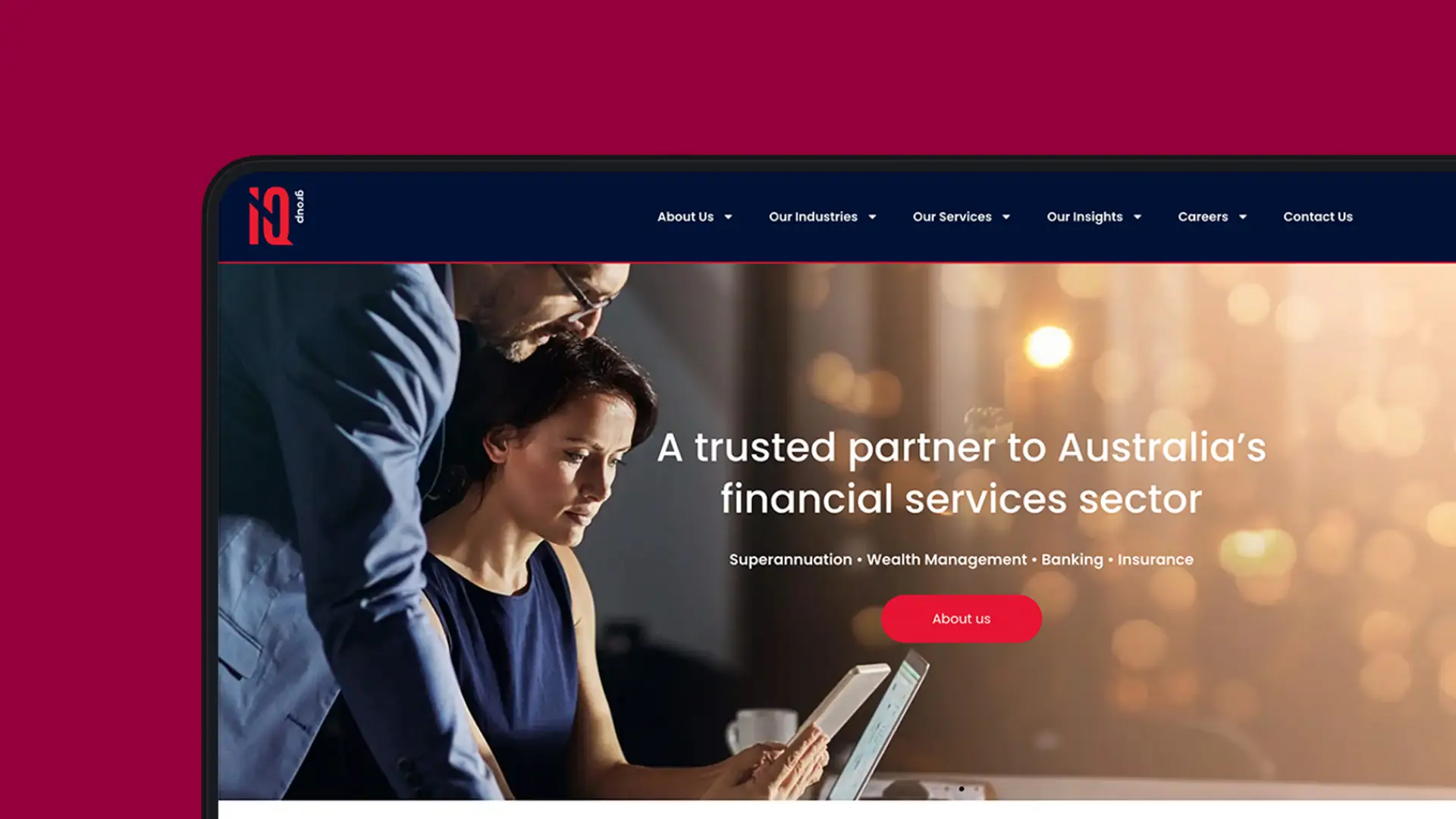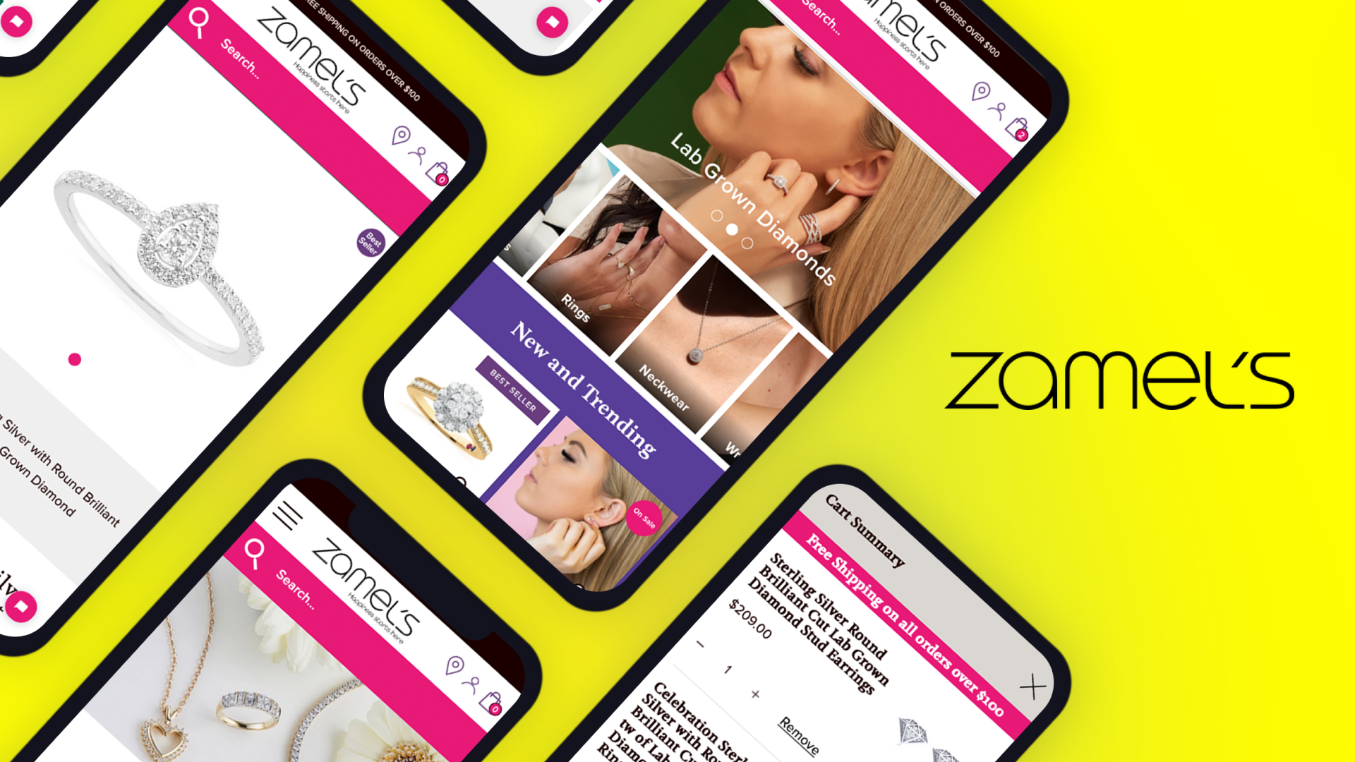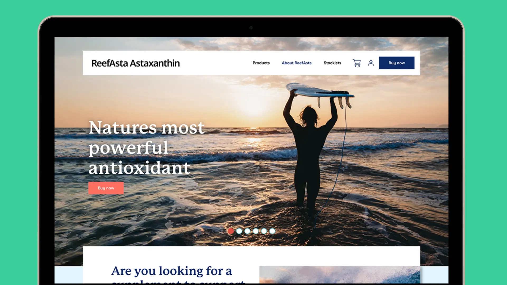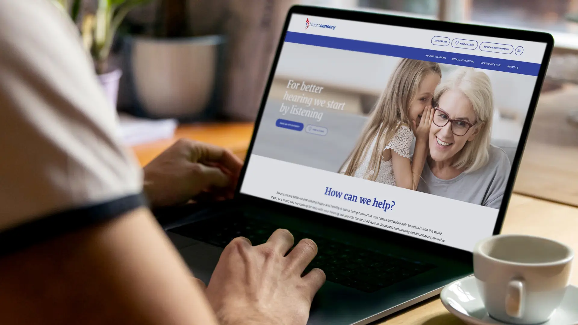
Neurosensory is one of Australia’s largest independent hearing health providers, with clinics from Brisbane through to northern New South Wales and referral relationships with more than 60 ENT surgeons. In 2021 we redesigned their website around the two audiences it actually serves: patients arriving with a symptom, and the doctors who refer them.
Neurosensory has spent four decades in hearing health. Diagnostic testing, hearing aids, cochlear implants, tinnitus, dizziness and balance disorders, auditory processing. They are independent and commission-free, which in a sector where most retail audiology sits inside hearing aid manufacturers is the most commercially important fact about them.
The site they had did not say so. Built in 2018, it opened on a stock portrait and the headline “Your future sounds amazing….” – a pun that told a visitor nothing about hearing loss, about diagnosis, or about why Neurosensory was different from the shopfront down the road.
We had worked with Neurosensory before, on the naming and launch of their ListenUp program, so we came to the website already knowing the business and the sector.
The brief
Two audiences, one site, and very little room for either.
Patients arrive with a symptom rather than a service name. Ringing in the ears. Dizziness. A child who is not responding when spoken to. They need to find the condition, understand what happens at an appointment, and book one.
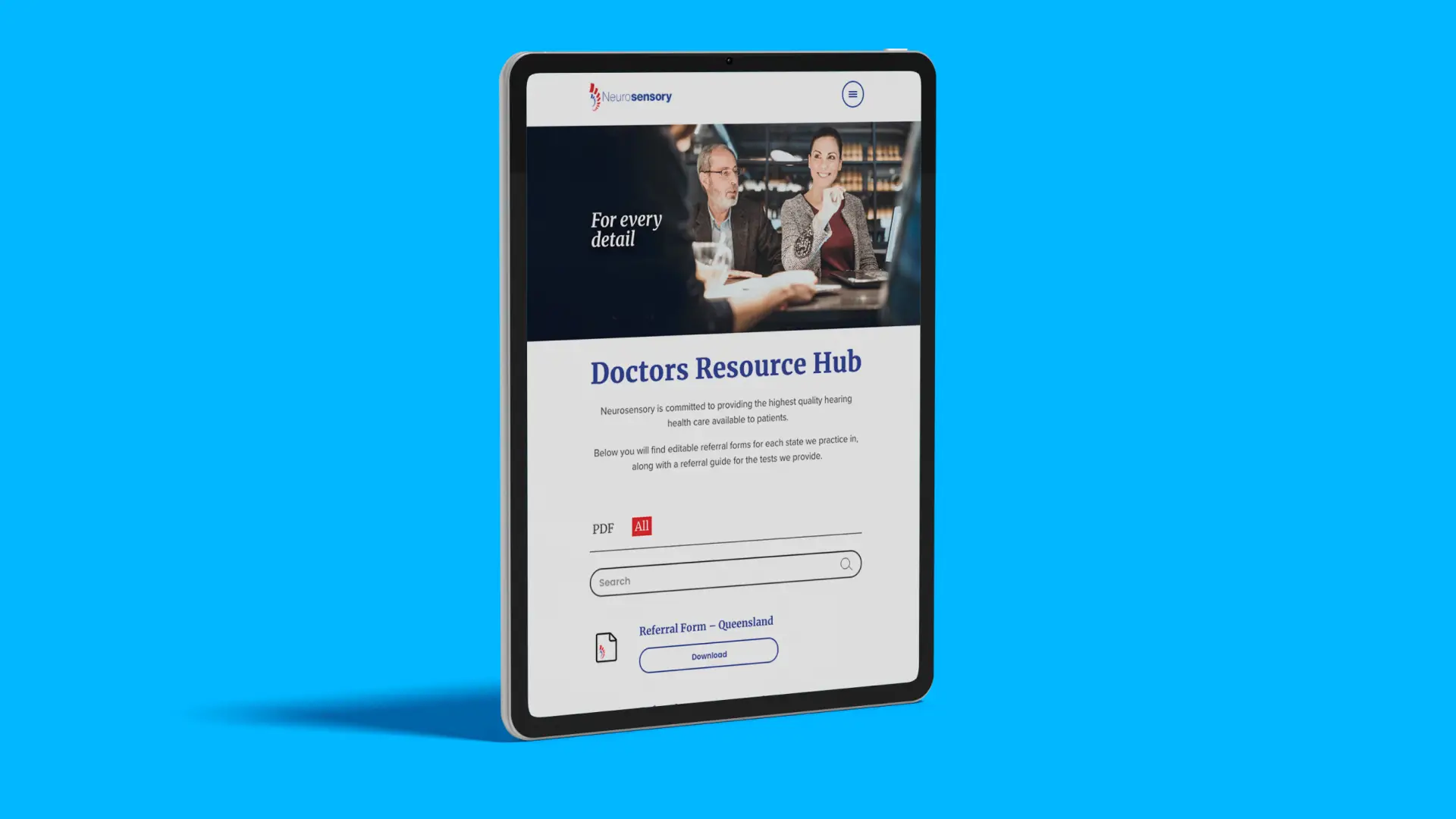
Referrers arrive with a completely different job. GPs and ENT specialists need the correct referral form for their state, and they need it inside a minute, between patients.
The 2018 site served the first group poorly and the second barely at all. Desktop navigation sat behind a hamburger menu, so the depth of the site was invisible to anyone who did not go looking. “Medical Professionals” was one of five small tiles tucked under the hero, and one of four icon captions below it. The independence and commission-free position, the strongest argument the business has, sat in forty words under an icon.
The approach
This was a collaboration. Digital strategist Casey Aimer led information architecture and wireframing. The Animals led design and messaging. The structure that came out of Casey’s work is the reason the rest of it holds together, and the single biggest decision was to stop treating referrers as a subsection of a patient website.
The GP Resource Hub became a destination of its own, with editable referral forms for every state Neurosensory practises in, a referral guide for the tests they provide, and search and filtering across the lot. A GP can land, filter, download and be gone.
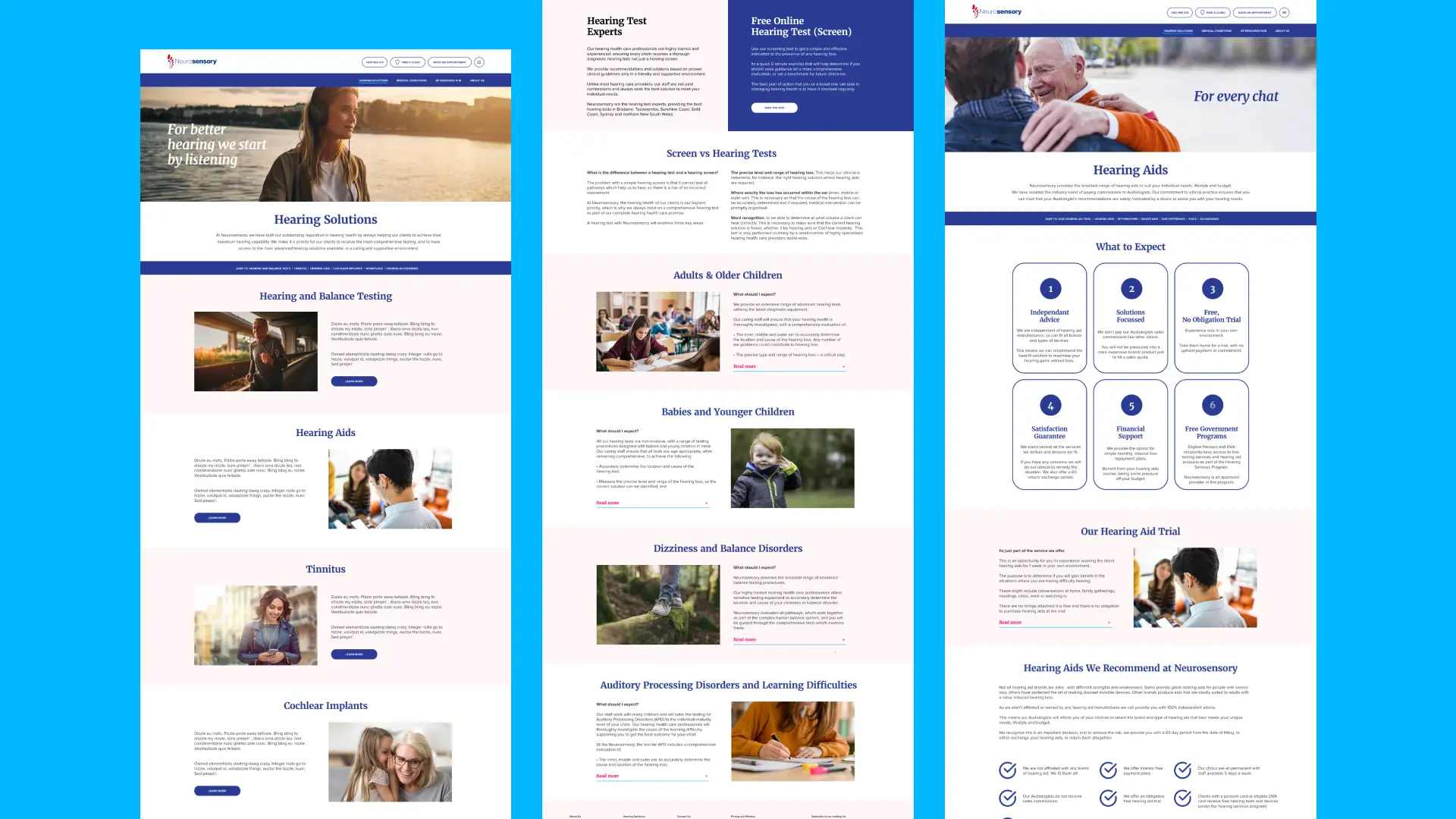
On the patient side the site is organised by condition rather than by service. Hearing and balance testing, hearing aids, cochlear implants, tinnitus, dizziness and balance disorders, auditory processing disorders and learning difficulties, children’s hearing. Each one addressable, each one written for somebody who does not yet know which of them applies to them.
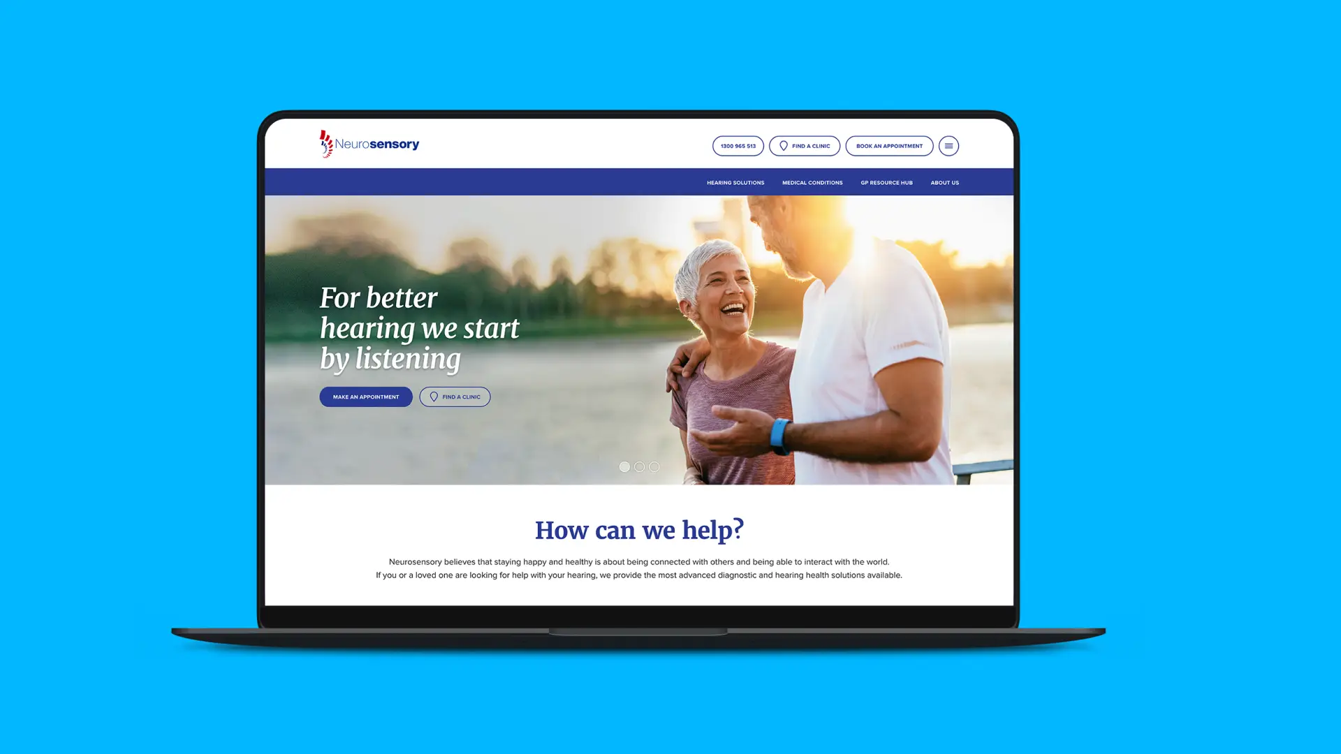
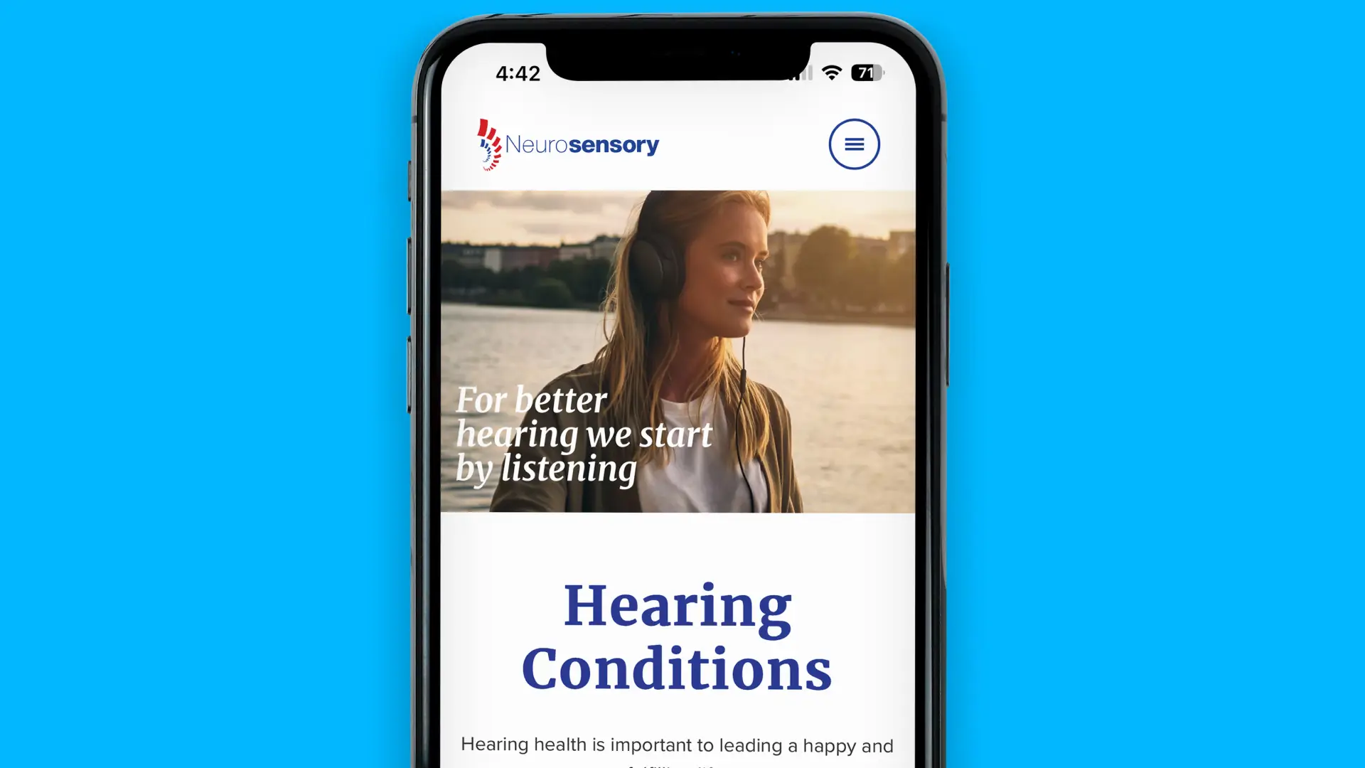
The messaging work started with the headline. “For better hearing we start by listening” does two jobs at once. It describes the diagnostic process honestly, and it stakes the independence claim without turning it into a sales line.
Underneath it, we turned the differentiators into something a patient can actually weigh up. The hearing aid pages now open on What to Expect: six plain commitments covering independent advice, solutions rather than sales, a free no-obligation trial, the satisfaction guarantee, payment options and eligibility for free government programs. The same information existed on the old site. It was just not presented as a reason to choose them.
We kept what worked, too. The line about staying happy and healthy being a matter of staying connected to other people survived from the old site onto the new one, because it was the one piece of writing that already sounded like them.
The results
The site now shows its own depth. A persistent navigation with four clear paths where there was a hamburger menu. A clinic finder where there was “Find Us”. A referrer hub where there was a tile.
More usefully, it is now findable the way people actually look for hearing health. Somebody searching a symptom rather than a service name has somewhere to land, and the referral relationships that drive the business have a destination built around how little time a GP has.
The site has been live since 2021 and has continued to evolve with the business.
Why this project matters to us
Healthcare is one of the sectors we know best, and hearing health shows why it needs a particular kind of care. The person searching is often worried, frequently older, and very often doing it on behalf of a parent. The clinician referring them has about ninety seconds. Designing for both of them at once, in one site, without either feeling like an afterthought, is the real problem to solve.
It was also a genuinely shared project. Casey’s architecture made most of the design decisions obvious, which is the best thing you can say about information architecture.
If you are running a healthcare business where both patients and referrers matter, we would love to talk.