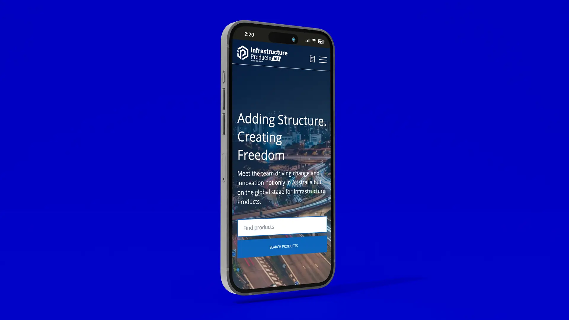
This infrastructure website case study covers how The Animals designed the mobile experience and the core page templates for Infrastructure Products Australia — the home of four of the country’s most established names in civil infrastructure: Aus Pits, Cubis Systems, Tri Underground and Burdens, and part of CRH, the global building solutions leader.
Infrastructure isn’t a sector that traditionally rewards beautiful digital experiences. It rewards clarity, accuracy and trust. So when IPA set out to bring four respected legacy brands under a single, modern parent identity, the website had to do more than look good — it had to make a complex business feel coherent for engineers, specifiers, contractors and procurement teams across communications, water, transportation and energy.
The original site was designed by Grant from PENSO (then part of AJF Growth Ops, since closed) and project-managed by Leigh at Decode.com.au. The Animals joined the project to design the mobile experience and a suite of core page templates that gave the site its structural backbone — the spine of this infrastructure website case study.
The brief: a multi-brand infrastructure website case study
IPA needed a digital presence that could carry four product brands, four infrastructure sectors and a national network of teams — without making customers feel like they were navigating four different companies.
The Animals were specifically asked to design the mobile experience end-to-end and to deliver the six templates that would do the heaviest lifting on the site: the Projects index and individual Project detail pages, the Sector detail pages, the About page, the Careers page and the Blog index.
In a category where most websites still treat mobile as an afterthought, the brief made it the priority.
The approach to this infrastructure website case study
We started with the people who actually use these sites — engineers checking a product spec from a job site, specifiers shortlisting suppliers on a phone between meetings, contractors looking up a project reference at 6am before they leave the yard. Mobile wasn’t a smaller version of desktop. It was the primary surface.
From there, the template system was designed around three principles: structured information first, generous white space second, and a confident, navy-and-blue visual language that signalled engineering credibility without feeling cold. Project detail pages were built around a fixed-position key-details panel (client, location, status, category, value) so the most-asked questions were always answered above the fold. Sector pages combined narrative copy with a key facts and figures band, then a featured projects strip — a structure that flexes whether IPA has 4 reference projects or 400.
Across every template, the same logic: make it easy to skim, easy to verify, easy to act on.
The results
The templates The Animals delivered now anchor IPA’s digital presence and carry the weight of the broader product and sector content. The mobile experience — designed first, not retrofitted — gives the brand a level of polish that’s genuinely rare in the infrastructure category, and a navigation pattern that holds up across a four-brand portfolio.
The build itself was led by Leigh at Decode.com.au, whose project management and engineering rigour kept a complex multi-stakeholder infrastructure website case study on track and at standard.
Why this project matters to us
Infrastructure is the work behind the work. It’s pits and conduits, cable protection and access covers — the parts of the built environment most people never see. Designing for a business like IPA is a reminder that craft matters everywhere, not just in the categories that traditionally attract it.
You can see how we approach equally complex, multi-audience briefs in other categories in our Shopify case study for Mazzucchelli’s and the Leor early childhood education campaign.
If you’re looking for a Melbourne advertising agency that can take a complex, multi-brand, technically demanding brief — and turn it into a mobile-first infrastructure website case study that respects the people who actually use it — we’d love to talk.